Kepler's Third Law
Using "Graphical Analysis"
![[Up]](../../../NavIcons/Up.GIF)
![[Home]](../../../NavIcons/Home.GIF)
![[Help]](../../../NavIcons/Help.GIF) [Lab
Index]
[Lab
Index]
BHS
-> Staff
-> Mr. Stanbrough
-> AP
Physics-> AP Labs-> this
page
It took Johannes Kepler many years of laborious and painstaking labor
to discover his famous laws. With the power of modern computers and
software, however, a high school student can "discover" Kepler's
Third Law in less than five minutes!
Note: If you need additional help using Graphical Analysis, ask
your instructor or consult the "How
Do I ..." Index.
Entering the Data:
- Start the Graphical Analysis program.
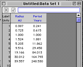
- In the Data Set window, enter the data from Table
14-3 (page 334) of the text (or from the table below). You want to
enter the left-hand column of data (Semi major axis of orbit in
AU) as X, and the right-hand column (Orbital period in years) in
the Y column. The middle column in Table 14-3 is not used. Note
that the program redraws the graph as you enter each new data
pair.
- You may want to adjust the number of significant digits (use
"3 decimal places") the program displays. Select Data
Options from the Data Menu.
- Click on the "X" and change the column label to "Radius".
Enter "AU" as the units for this column. In the same way, change
the "Y" label to "Period" with units of "years".
- Click in the Text Window, type your name to
identify your graph, and indicate that this is data for Kepler's
Third Law taken from Table 14-3 (page 339) of the text.
- The graph automatically generated by the program certainly is
pretty, but not tremendously instructive. You can zoom in to look
at the points crowded down by the origin by selecting a rectangle
with the mouse, and then selecting Zoom In from
the Graph menu. You can return to the original graph by
selecting Auto Scale from the same menu. This really doesn't help
to determine the relationship between the radius and period, but
it sure is fun...
Analyzing the Data - The "Old Fashioned Way"
Suppose that you suspect that the relationship between the radius
(r) of a planet's orbit and its orbital period (T) is a power
relationship, that is:
T = rn
The question is, what is the value of "n"? There is a very slick
technique to find "n" that is based on the following mathematics:
Take the logarithm of both sides of the equation above:
ln(T) = ln(rn)
so:
ln(T) = n ln(r)
This equation says that if you graph ln(T) versus ln(r), you will
get a straight line whose slope is n! (Confused? If you substitute y
= ln(T) and x = ln(r) in the last equation above, you get y = nx. The
graph of this function is a straight line with slope n, right?)
Here's the procedure: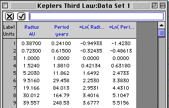
- Click the heading of the Radius data column to select the
column. (Be sure the cursor is an arrow).
- In the Data menu, select Column
Formula, and "ln" from the sub menu. The Graphical
Analysis program will calculate the logarithm of each
number in the Radius column, and create a new column for this
data. Neat, huh?
- Repeat the last step to create a ln(Period) column.
- To graph this data you can either:
- Drag the column heading from the Data Window over
the current Graph Window axis label. The graph will
change to display the new column of data on that axis. Or,
- Click on the axis label. A menu will pop up allowing you to
select any available data column.
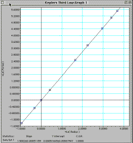
- Notice that the graph of ln(Radius) versus ln(Period) is a
straight line. You can have the program draw the "best fit line"
by selecting Regression Line from the Graph
menu. The program will also compute and display the slope of
this line for you by selecting Regression
Statistics in the Graph Menu.
Analyzing the Data - Automatically
- Switch the graph back to display Period (y-axis) versus Radius
(x-axis).
- Go to the Graph menu and deselect Regression
Line and Regression
Statistics.
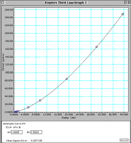
- Select Automatic Curve Fit from the
Analyze menu. Now choose Power from the
dialog box that opens. This is somewhat faster and easier than
analyzing the data by hand...
- Notice that the program displays the power equation parameters
and a "Mean Square Error" number that gives you a measure of how
well the data fits the mathematical model that you have
selected.
Printing & Saving
Print a copy of your final screen (Print Screen
is in the File menu.). Notice that you can also print the
data and graph separately, and also copy the data and the graph to
the Clipboard and then paste them into other applications. This would
be handy for writing lab reports...
Go Nuts!
Go ahead and explore other Automatic Curve Fit
functions as well as other features of the Graphical Analysis
program. Have Fun!
[Lab
Index]
BHS
-> Staff
-> Mr. Stanbrough
-> AP
Physics-> AP Labs-> this
page
last update August 25, 2000 by
JL Stanbrough