AP Physics - Experiment 1a
Using DataStudioTM to Graph Experimental Data
- Part 1


![[Up]](../../../NavIcons/Up.GIF)
![[Home]](../../../NavIcons/Home.GIF)
![[Help]](../../../NavIcons/Help.GIF) [Lab
Index]
[Lab
Index]
BHS
-> Staff
-> Mr. Stanbrough
-> AP
Physics-> AP Labs-> this
page
Purpose:
This lab is a little different. It's purpose is to show how the
Pasco DataStudioTM software can be used to analyze
experimental data graphically. Very soon, you will be using this
software to collect data (using sensors of various types) as well as
analyze it, so this laboratory exercise can serve as an introduction
to part of the DataStudioTM software.
Discussion:
Calculating and graphing experimental data is vitally important,
but it is generally time-consuming and tedious, too. (You might have
noticed that in the beginning labs of this course...) While it is
important that you be able to make calculations from data and draw
graphs from data "by hand", the computer provides a powerful tool
that takes a great deal of the drudgery out of data analysis. In this
laboratory exercise, you will re-graph, using the computer, the
experimental data from the "Force vs.
Stretch for a Spring" lab - just to see how it is done.
Equipment:
|
DataStudioTM software
|
the DataStudioTM file "f_vs_x_graph_ds"
|
your data from experiment 1 - "Force vs. Stretch for a
Spring"
|
Setup:
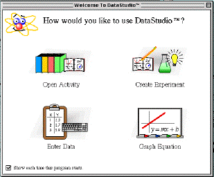
- Open the DataStudioTM software. Select "Open
Activity" from the initial screen, as shown below.
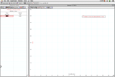
- Open the file "f_vs_x_graph_ds". Ask your instructor where you
can find this file. Your screen should look like the picture
below:
Procedure:
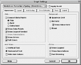
- First, open the graph settings dialog by clicking its icon
(
 )
in the graph's tool bar (right side). The graph settings dialog
will open, as shown below:
)
in the graph's tool bar (right side). The graph settings dialog
will open, as shown below:
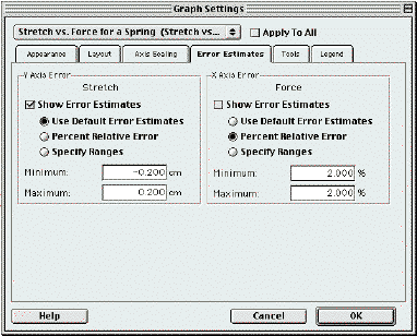
- Click on the "Error Estimates" tab to bring up the Error
Estimates dialog. Notice that default values have already been
added for you
 0.2 cm for stretch and
2% for force. If these values are not acceptable, you can edit
them now.
0.2 cm for stretch and
2% for force. If these values are not acceptable, you can edit
them now.
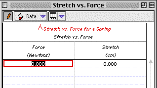
- Now, it's time to type your data into the data table. For
this exercise, we will only process data for
one spring - your
choice. Enter your data (calculations, actually) for force and
stretch in the appropriate columns of the data table. Notice that
as you add data, it is automatically graphed, and the graph's
scale is adjusted to show all of the relevant data so far.
Results:
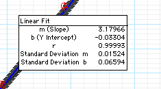
- When all of your data is entered, pull down the
 submenu, and select "Linear". The software will automatically draw
the "best-fit straight line" through your data points and
calculate its equation - "m" and "b" are the slope and y-intercept
of the best-fit line (in the equation y = mx + b). The value of
"r", called the correlation coefficient, is a statistical measure
of how closely the data points fit the line. The closer that the
value of "r" is to 1 (or -1, for a negative slope), the better the
fit.
submenu, and select "Linear". The software will automatically draw
the "best-fit straight line" through your data points and
calculate its equation - "m" and "b" are the slope and y-intercept
of the best-fit line (in the equation y = mx + b). The value of
"r", called the correlation coefficient, is a statistical measure
of how closely the data points fit the line. The closer that the
value of "r" is to 1 (or -1, for a negative slope), the better the
fit.
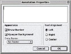
- Before you print your graph, you can add an identifying note
by pressing
 in the graph's toolbar. Then, move the mouse to the position where
you want the note to appear, and click. The Note Dialog (shown
below) will appear. (You might want to select "No Pointer" from
the Data Pointer menu, or your note will point to your graphed
line. It's not a big deal, however.)
in the graph's toolbar. Then, move the mouse to the position where
you want the note to appear, and click. The Note Dialog (shown
below) will appear. (You might want to select "No Pointer" from
the Data Pointer menu, or your note will point to your graphed
line. It's not a big deal, however.)
- To print the data table, select it with the mouse, then choose
"Print" from the file menu.
Conclusions:
You don't need to restate your original conclusions, but what do
you think about computerized graphing (as compared to manual
graphing)?
[Lab
Index]
BHS
-> Staff
-> Mr. Stanbrough
-> AP
Physics-> AP Labs-> this
page
last update July 25, 2003 by
JL Stanbrough