Graphical AnalysisTM
Changing Graph Options
![[Up]](../APPhyNet/NavIcons/Up.GIF)
![[Home]](../APPhyNet/NavIcons/Home.GIF)
![[Help]](../APPhyNet/NavIcons/Help.GIF)
BHS
-> Staff
-> Mr. Stanbrough ->GA
How-To Notes -> this page
To change graph options, select "Graph Options" from the "Graph"
menu.
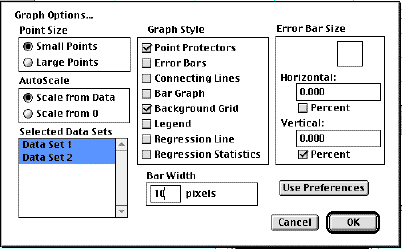
The graph options dialog is show above. Some of the commonly used
options are:
- Point Size - This is largely a matter of preference,
however, if you don't use point
protectors, you should probably use Large Points.
- AutoScale:
- Scale from Data means that the program will
automatically scale the graph so that the data points are all
visible in the graph, and so that the data points fill the
graph.
- Scale from 0 means that the axes origin will always
appear in the graph.
- Selected Data Sets: Displays a menu of all data sets
you have entered. You can select one or more data sets to appear
in a graph. In the screen shot shown above, bot Data Set 1 and
Data Set 2 will be displayed in the (same) graph.
- Graph Style:
- Point Protectors are
small symbols (squares, rectangles, circles, etc.) that appear
around data points that make them easy to find on the graph and
also identify which data set they belong to. This option can
also be selected/deselected from the Graph Menu.
- Error Bars graphically
indicate the estimated
uncertainty of the data points. This option can also be
selected/deselected from the Graph Menu.
- Connecting Lines are the "connect the dots" type of
graph that you NEVER, NEVER,
NEVER draw in Physics class.
- Bar Graph displays the data
in bar graph form. This is of limited usefullness in Physics.
(See Bar Width.) This option can also
be selected/deselected from the Graph Menu.
- Background Grid turns the "graph paper" background
on and off. This option can also be selected/deselected from
the Graph Menu.
- Legend displays a small chart identifying the
point protectors of the various
data sets displayed in a graph. This option can also be
selected/deselected from the Graph Menu.
- Regression Line
displays the "best straight line" that fits the current data.
It of course, is only useful if the quantities being graphed
have a linear relationship. (If the relationship is not linear
try a curve fit.) This option
can also be selected/deselected from the Graph Menu.
- Regression Statistics
displays the slope, y-intercept, and the corelation coefficient
for the best fit regression line. A corelation coefficient of 1
means that all data points perfectly fit a straight line of
positive slope. A corelation coefficient of -1 means that all
data points perfectly fit a straight line of negative slope.
Therefore, if the absolute value of the corelation coefficient
is close to 1, it means "good fit for a straight line". This
option can also be selected/deselected from the Graph
Menu.
- Bar Width refers to the width
of the bars drawn for a bar graph.
- Error Bar Size: You can
specify the size of the horizontal and vertical error
bars. If the "Percent" box is checked, then the number entered
in the field is considered to be a relative
uncertainty, otherwise, it is considered to be an absolute
uncertainty.
- Use Preferences overrides the current graph options
settings.
last update July 3, 2000 by JL
Stanbrough