AP Physics - Experiment 2a
Using DataStudioTM to Graph Experimental Data
- Part 2
![[Prev]](../../../NavIcons/Prev.GIF)
![[Next]](../../../NavIcons/Next.GIF)
![[Up]](../../../NavIcons/Up.GIF)
![[Home]](../../../NavIcons/Home.GIF)
![[Help]](../../../NavIcons/Help.GIF) [Lab
Index]
[Lab
Index]
BHS
-> Staff
-> Mr. Stanbrough
-> AP
Physics-> AP Labs-> this
page
Purpose:
This lab extends the previous DataStudioTM lab in two
ways:
- you are going to analyze a slightly more-complicated
situation, and
- you are going to construct your own experiment file.
As in the previous
DataStudioTM lab, you will reanalyze data from a prior
experiment - in this case, the "Period of
SHM" data.
Discussion:
Back in the "good old days" (I know how you young people love to
hear stories about the "good old days"!), when data analysis was done
by hand - perhaps with the aid of a slide rule or table of logarithms
- the standard (only!) way to do it was to find some mathematical
combination of the experimental quantities that would graph to a
straight line. It was just too much computation, even for the most
enthusiastic young physicist, to do it any other way. Today, even
though computers have revolutionized data analysis (among other
things...), straight lines are still very important and commonly
used.
In this lab, you will learn how to set up a graph, perform
calculations on data, and graph and analyze the transformed data.
Equipment:
|
DataStudioTM software
|
your data from "Experiment 2 - Period of SHM"
|
Setup:
- Open the DataStudioTM software. This time, click on
"Enter Data" from the initial screen. You should get a screen like
this:
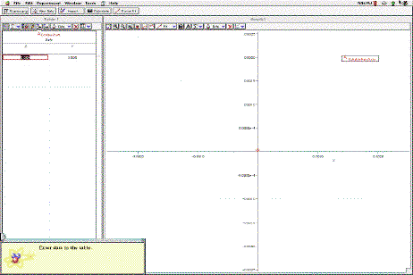
- You could just begin typing your data into the data table, but
it would be more professional to customize the setup just a bit.
Click the
 button at the left of the main toolbar. This opens the Summary
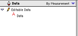
Window, which contains Data and Display panes. The Data pane lists
all of the data sets generated so far (The data set
Adata under Editable Data is data Table 1.), and the
Display pane shows the ways in which the software can display the
data.
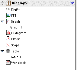
button at the left of the main toolbar. This opens the Summary
Window, which contains Data and Display panes. The Data pane lists
all of the data sets generated so far (The data set
Adata under Editable Data is data Table 1.), and the
Display pane shows the ways in which the software can display the
data.
|
|
|
The Data pane appears at the top of the Summary
window. It shows - and allows you to access - all of the
data generated in the experiment.
|
The Display pane appears at the bottom of the Summary
window. It shows - and allows you to select - the ways in
which your data can be displayed. You can change the name
of a graph or table by clicking on it and typing the new
name.
|
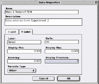
- Double click the data set name (Adata) in the Data
pane, and the Data Properties dialog will open. Here, you can
rename the data set and the x and y quantities (with units). You
generally don't need to specify minimum or maximum values for the
data - the software will calculate them from the data you will
enter. "Precision" in this dialog means the number of significant
digits displayed.
- Finally, click the settings button (
 )
in the graph's toolbar. Uncheck "Connect Data Points" in the
"Appearance" pane (Aarrrrrggggghhhhh!). Then select the "Error
Estimates" tab and enter the estimated uncertainties for mass and
period.
)
in the graph's toolbar. Uncheck "Connect Data Points" in the
"Appearance" pane (Aarrrrrggggghhhhh!). Then select the "Error
Estimates" tab and enter the estimated uncertainties for mass and
period.
Procedure:
- Type your mass and period data into the data table. Note that
the points are (again!) plotted on the graph, and the scale
adjusted, as you type.
Results:
- Now, you need to find the equation that best fits your data.
You can try some of the functions in the
 menu (in the graph's toolbar), but I don't think you are going to
find a really-good fit for this data from the given functions.
Note: You may get a reasonable fit from "Polynomial", but
this doesn't say much. Physicists generally scoff at a polynomial
fit. This is because there is an interesting theorem in
mathematics that says that you can fit a polynomial to any
continuous curve (over a restricted domain) if you are willing to
calculate enough terms in the polynomial.
menu (in the graph's toolbar), but I don't think you are going to
find a really-good fit for this data from the given functions.
Note: You may get a reasonable fit from "Polynomial", but
this doesn't say much. Physicists generally scoff at a polynomial
fit. This is because there is an interesting theorem in
mathematics that says that you can fit a polynomial to any
continuous curve (over a restricted domain) if you are willing to
calculate enough terms in the polynomial.
The DataStudioTM software has a "quirk" in that it will
only do calculations on the independent (y-axis) variable - period
in this case. We can't, therefore, plot the square root of mass
vs. period - but this is not a problem, really. We will simply
plot mass vs. period2, which is logically
(mathematically) equivalent.
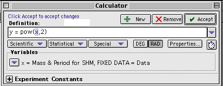
- Click the calculate button (
 )
in the main tool bar. (Note: There is also a
calculate button in the graph's toolbar (
)
in the main tool bar. (Note: There is also a
calculate button in the graph's toolbar ( ),
which works similarly, but not exactly the same. You can try it
sometime.) The Calculator Dialog will appear. Select "pow(x, 2)"
from the
),
which works similarly, but not exactly the same. You can try it
sometime.) The Calculator Dialog will appear. Select "pow(x, 2)"
from the  menu. Click the
  when your dialog looks like the one below.
- If all has gone well, you will notice a new data set listed in
the Data pane of the Summary window. To create a data table for
this data, simply drag its icon from the Data pane and drop it on
the Table icon in the Displays pane.
- To create a graph for this data, drag the data icon from the
Data pane and drop it on the Graph icon in the Displays pane. You
will need to change the Settings ()
for this graph (uncheck "Connect Data Points", and set appropriate
"Error Estimates").
- DataStudioTM does not automatically change the axis
labels and units when a calculation is performed. To do this,
press the
 button in the Calculator dialog. The Data Properties dialog for
the calculated data will appear, and you can make appropriate
changes (y-data is now "Period squared", and units are "sec^2",
for instance).
button in the Calculator dialog. The Data Properties dialog for
the calculated data will appear, and you can make appropriate
changes (y-data is now "Period squared", and units are "sec^2",
for instance).
- Now, you can go to the
submenu and select "Linear" (or "Proportional") to get a best-fit
straight line for mass vs. period2.
- You can plot your data for other springs by selecting "New
Data Table" from the "Experiment" menu, and starting over.
Conclusions:
As before, it isn't necessary to restate your conclusions from the
original experiment (unless they have changed!), but what do you
think about this method of data analysis?
[Lab
Index]
BHS
-> Staff
-> Mr. Stanbrough
-> AP
Physics-> AP Labs-> this
page
last update August 29, 2003 by
JL Stanbrough